Growing your SaaS business and acquiring new customers is pretty challenging. There are quite a lot of competitors that aim for the exact same thing — they want to increase and optimize their conversion rate with minimal expenses.
While that's easier said than done, there are still quite a few things you can tweak on your website to optimize your conversion rate. So, if that's what you're here for, you're in the right place.
Without further ado, let's get into each page on your website and see the best practices for conversion rate optimization.
Home Page
The home page is often the first page users run into if they look for your SaaS business. Because of that, it's really important to design it in a way that gets them to convert into customers.
Let's see how you can do that.
Avoid cluttering your home page
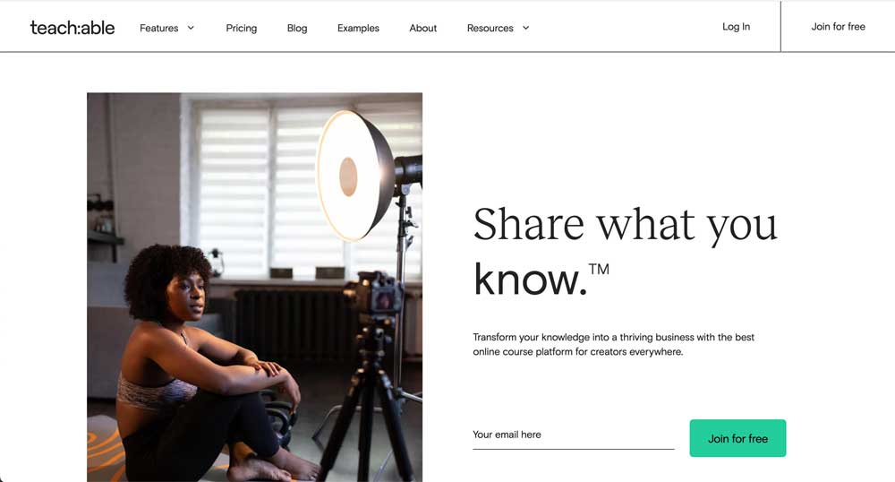
We didn't want to state what everyone does, but that doesn't make it a lie: just keep it simple.
This means that you don't need tons of visual effects on your homepage or something impressive that nobody else has thought of.
All you need to do is stick to what they're already used to – a clean and modern design with lots of white space.
Your home page should be a place where users can find basic information about your company: your value proposition, a SaaS solution, and a couple of testimonials.
Anything that doesn't serve much purpose can be removed.
So, go take a look at your home page and ask yourself the following questions:
- Is there too much information about your product?
- Do you have too many CTAs that confuse the users?
- Is there anything on your website that doesn't contribute much to your growth?
Share testimonials
Be honest: if a company claimed that their product is the best there is on the market, would you believe them? Probably not.
But, if a friend or someone outside of that company recommended it, you would most likely take it into account. The same goes for your customers.
The best way to convince other people that your product is the one they should purchase is to include testimonials of other users on your home page.
You don't need too many of them as you don't want to clutter your home page, so two or three are enough.
Bonus tip: add testimonials from influential people if you can find a way to connect with them.
Provide other forms of social proof
Aside from testimonials, other forms of social proof can be included on your homepage.
For instance, you can include the names of some big companies you're working with or put a number of users where everyone can see it. This will show users that they will be in good hands.
You could also share a success story that gives users a glimpse of a real-life scenario where a product helped them improve.
Case studies are also great because they're data-driven and provide an in-depth analysis of the product you offer.
Highlight your value proposition
Your value proposition is basically an emotional hook that website users experience — but only if done right.
Considering that your value proposition is the first thing website visitors will see, we have a couple of tips for you.
First things first, your value proposition headline should be crisp and impactful, as should be the supporting copy. This is not the time to elaborate; you can do that once you're closer to converting them into customers.
Once you have the right copy, it's time to place it in the background. The best kind of backgrounds are those that support the overall idea and aren't too distracting.
At last, don't forget to include a CTA button that will lead to the features page. Outsourcing application development is a great way to get the job done quickly and effectively.
Use the footer wisely
Users often don't pay attention to all sections of the page or read the entire copy. Because of that, you need to think strategically and place important links at the bottom of the home page.
Your footer should include links to the About Us and Contact Us pages, as well as important landing pages, product info, and newsletter subscriptions. If you have more than a few links, organize them into vertical sections.
Links in the footer are especially important for mobile phone users because otherwise, the user has to scroll back to the top to further investigate the site. The same goes for mobile apps.
Lead users toward the desired action
Leading the users toward the desired action doesn't happen with just one CTA button on your home page, but it definitely starts there. It all comes down to defining the user journey.
A user journey is a path users take to reach a particular goal. Most people don't just decide to buy something right off the bat.
They often visit multiple pages to inform themselves about the product before they finally make a purchase and convert into customers.
So, the first thing you want to do is analyze how users behave when they enter your website. What are they clicking on? How do they move through pages, and in what order?
Once you have all of the data, you can analyze potential obstacles.
For instance, if a high percentage of users abandon the features page right before they reach the pricing page, look into it. There might be something wrong with the features page.
Features Page
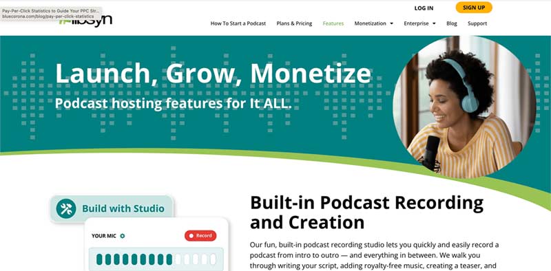
A features page is a page that is designed to promote a product or service. It usually has the company logo, a testimonial or two, and an image of the product.
But there are a couple of additional ideas you can include to get it to convert better.
Put up an explainer video of your product
A video is a great way to explain the product and its features in a concise and engaging way. These videos shouldn't be too long, so it's best to keep them 1 to 3 minutes long.
Here are some tips for the best explainer video:
- Remember that it's not a handbook. Your goal is to show how your product can benefit your customers, not to explain it in detail
- Address the customer's pain points first and then address the solution. This is the best way to grab their attention
- Be unique and original. Cliche videos that look like everyone else's won't do you much
- Optimize it for keywords. You don't just want people to run into your explainer video by accident when you can also optimize it for keywords
Create an easy navigation system
A good navigation system that leads to your feature page with just one click is a must for multiple reasons.
First things first, you don't want to have users looking for where to click when they want to get to the feature page from other pages on your website. A lot of them won't have the patience for that and will simply give it up.
Google also relies on navigation when determining how important the page is. If your feature page is one click away from your home page, it's probably more important than the page you've deeply buried on your website.
Provide a FAQ section
A FAQ section doesn't only provide a shortcut for users to get the answers they need.
It's also an opportunity to convince them that your solution is the best for solving their problems. After all, this is what they came for.
If you're not sure what to include in your FAQ section, here are a couple of suggestions:
- What is SaaS?
- How can I make sure your platform is compatible with the tools we already use?
- How is your product different from the competitors' products?
- How do you protect your clients' data?
- Does your platform allow for integrations?
- How are your services billed?
We also advise you to analyze the questions your customer service receives and pick out a few of them to answer.
Pricing Page
At last, it's time to check out your pricing page. After all, this is ultimately a place where users decide whether or not your platform is worth their money.
Suggest the appropriate plan
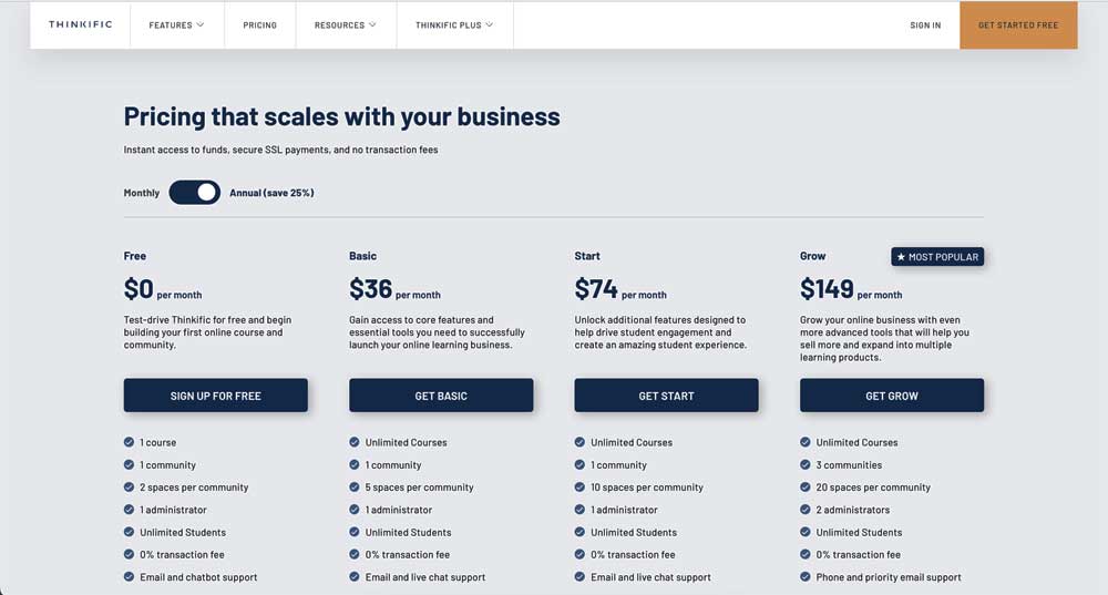
Users that reach your pricing page should be able to identify which plan fits their needs the most.
The best way to achieve this is to point out the key metric that separates one plan from another.
For instance, if one of your plans can handle more website visitors than the other, you want to show those numbers in an obvious manner.
You can also include a service calculator on your pricing page and ask the users to fill out a short form to determine the best plan for them.
Don't list too many plans and features
Listing too many plans is often confusing to people. Sticking to three or four pricing tiers is best to achieve marketing effectiveness.
But, if this is not an option, you should at least group your plans within interactive frameworks.
For instance, you can organize them based on the features your plans include. This is important if your target audience includes both big companies and small businesses — they don't need the same things.
Your feature list also shouldn't be too long. Now, we understand that it is sometimes necessary to list all of the features you offer, but there are better ways to do that than using an entire spreadsheet.
For instance, you can show the most important features right under the price of each plan and keep the rest of them hidden in a special tab. All the user has to do is click on the See all features to view them all.
Use a pleasant color scheme
Using a color scheme that is pleasant to look at is even more important on the pricing page than on other pages.
Remember — this is where the user has to make a purchasing decision, so you want to make sure they're as comfortable as possible.
You can go with pastels or bright colors, depending on the emotions you want to convey.
Of course, the color scheme you're using should match your brand's color palette.
Conclusion
We hope this blog helps you build a SaaS website that will ensure better conversion rate optimization.
You may be a bit overwhelmed now, but just go step-by-step and tweak one thing at a time.
Who knows, maybe you'll become an expert on conversion rate optimization.


